The New WWW Rule
WHO ARE YOU? WHAT DO YOU DO? AND WHY SHOULD I CARE?

After fifteen-years on the frontlines of redesigning websites for B2B and healthcare across all verticals, it still amazes me that many organizations have homepages up that are missing the most critical element – Effective Homepage Messaging. It’s well-known that websites need to convey a company’s value proposition within four seconds of hitting the homepage. Even as we approach 2022, the team here at Boston Web Partners still sees a high number of large and SMB companies failing to convey messaging effectively on their most important digital presence.
The WWW in front of the web address domain is an abbreviation for "World Wide Web." I now contend that this is false. In 2022, the WWW in front of your domain now stands for “Who Are You? What Do You Do? (Big Sigh) and Why Should I Care? followed by your organizations name, (.Com, .Co, .Net) All three of these questions must be answered. This should happen within the homepage messaging. You cannot rely on a web visitor exploring the rest of your site until you’ve answered these three questions. Let’s break this down and examine the messaging components.
Who Are You – A company logo traditionally located in the upper left of a website. This helps a web visitor understand they’ve landed at the right place. If you provide slug line underneath your logo, great! More on this later...
Messaging usually begins in the middle of your homepage. It doesn’t hurt to infuse your company name in front of your homepage messaging. This is an effective way of reinforcing your brand. Instead of stating “Leaders in Eliminating Client-Side Attacks”, put your company name in the front. {Your Company Name} is the Leader…
What Do You Do – Worded effectively, this reinforces the objective of the web visitors’ need to find a particular product or service. It’s why someone is on your site.
The “Big Sigh” - Yes, this is a component of the NEW WWW Rule. Businesses like to pretend all web visitors are eager to explore every page of their websites and read all about what their business does. The Big Sigh reminds us that your site may be the fifth website like yours that someone has visited. The fact is, web visitors do not read websites, they scan them at lightning speed and become impatient very quickly if they do not understand something after a first glance. It’s important to keep this “Big Sigh” mental posture in mind when developing your homepage messaging. Cut to the chase but be clear. Remove the fluff and use power words that resonate with your audience.
Finally, Why Do I Care – This is where many businesses fall flat in their messaging. Homepage messaging needs to be concise, yet impactful and grab someone’s attention. Think of the homepage as your billboard on the Internet highway. You only have so much time to tell your audience “why you” before they pass you by. What makes your business stand out? Are you the best, the most innovative, a leader, an emerging or a new existing entity? Does your product or service save me money, or increase profits? What is your brand promise?
So, how do you convey effective homepage messaging?
Homepage messaging may also be broken up into two or three parts. The number doesn’t matter so long as you satisfy the new WWW Rule. The first homepage messaging may live underneath your company logo. Be sure not to be too broad here. Using a phrase like “Unrelenting Innovation” under your logo sounds good, but unlike a big brand like Nike “Just Do It”, no one knows who you are or what that means.
The second and most common messaging lives in the center of your homepage. It’s a strong statement that clarifies exactly what this business is about with an advantage twist thrown in. The third messaging line is a sub-headline that may drive home the brand promise (if it feels right to you)
Let’s examine some examples of good and bad homepage messaging.
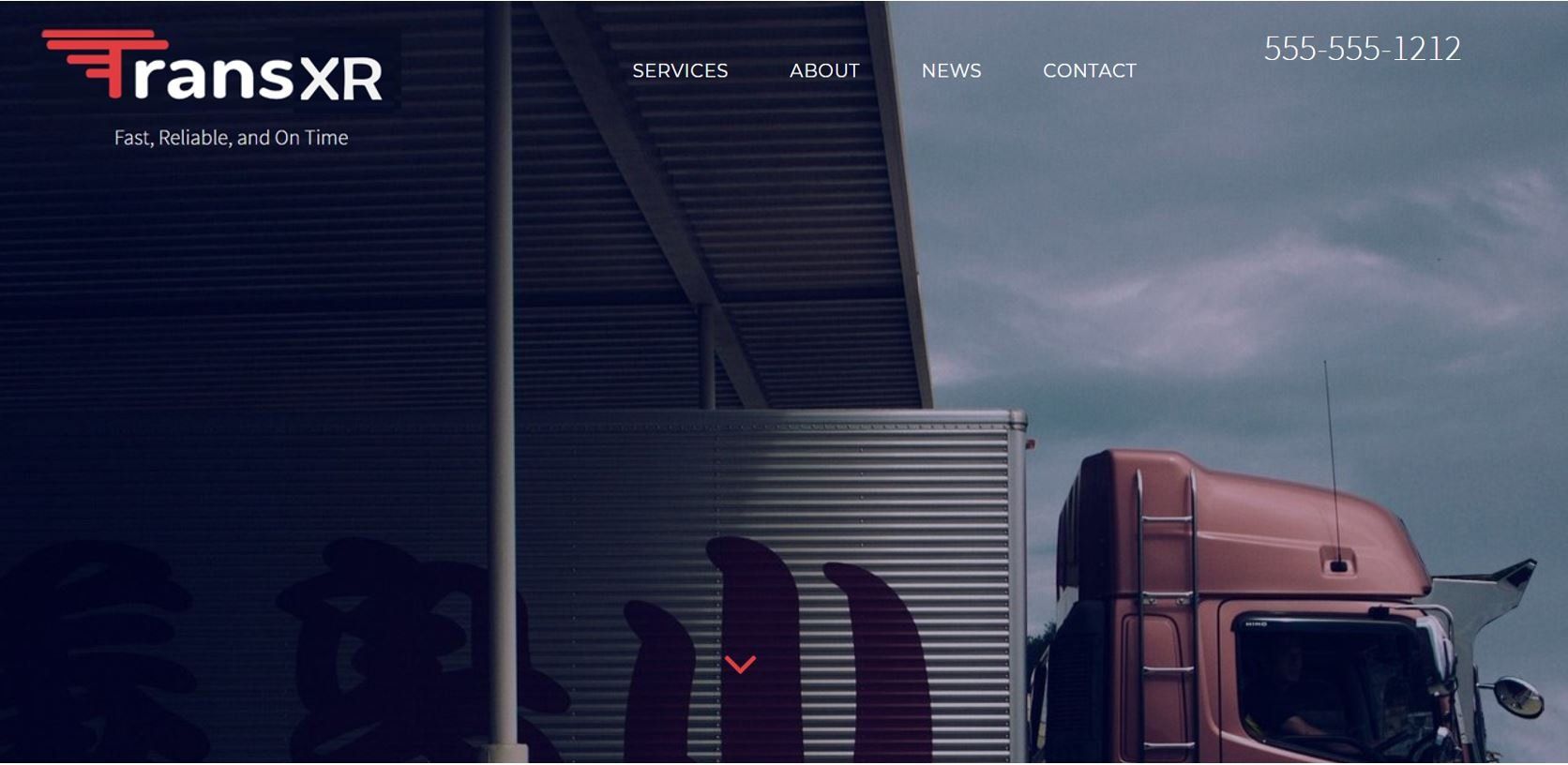
The messaging under the logo is too broad. I’m going to guess a trucking company, but the question begs, why should I work with them? Why are they different? What makes them special?
This is better. The messaging underneath the logo is still too broad, but note the headline messaging helps the web visitor understand more about the organization.
Note the stronger messaging underneath the logo. This carries into the theme of the main messaging and sub-headline. These two lines of messaging say it all. The WWW is answered and draws the web visitor into the website to learn more.
Final Thoughts
Homepage messaging plays a critical role in helping web visitors understand the NEW WWW Rule. Do any of these examples ring true with your business? Are you opening up your CMS as you read this to make edits?
Homepage messaging is just one of the areas Boston Web Partners’ assist our
website redesign clients with. Contact Boston Web Partners to see how we can redesign your website along with your homepage messaging to help you resonate with your prospects.
Let's Discuss Your Digital Marketing Project
Not in a rush? Fill out the contact form below with a better time, and we'll be in touch!
Spend 20 minutes on the phone with us to see if there's a fit.
(617) 419-0520
Not in a rush? Fill out the contact form below with a better time,
and we'll be in touch!
We will get back to you as soon as possible
Please try again later
About Us
Boston Web Partners is a full-service digital marketing agency focused on website design, SEO, SEM and brand visibility for B2B, High-Tech, Biotech & VC backed start-ups worldwide.
© 2024 Boston Web Partners, LLC.
All Rights Reserved.


